Autosport.com rethink
The title gives away the enormity of the project, the job was to rethink how the site looks and improve visibility of new modules without overly impacting the general goodwill and experience the site currently provides. So, what were the major steps:
1. Speak to internal stakeholders, speaking to various people around the business gave me immediate insight into the demands and needs internally.
2. Understand who our users are, we had a number of data points to help me form a view on our user base, we had a 3rd party tool that helped us compose a user around, sex, age, interests, behavioural patterns, income, etc so it helped me form a good view.
3. Analyse quantative data.
4. Workshops crazy 8's, continuing my engagement with the internal teams, I took around 14 people from various parts of the business into a deep dive on how they see the site developing, it was a great way to see how they saw the site and with journalists, marketing and sales guys involved they interact with our users a fair amount so had a good idea what they 'may' want. We focused on the homepage and I gave them a blank canvas asking them to focus on modules so not to become too focused on detail and it was also timed. I then asked them to all replay back their ideas and there were themes arising, so I asked the 14 to form groups based on these themes to refine or consolidate their ideas. I took these ideas away to help form the initial high-level wireframes.
5. Wireframing ideas.
6. Review and feedback.
7. UI design ready for rapid prototyping and testing.
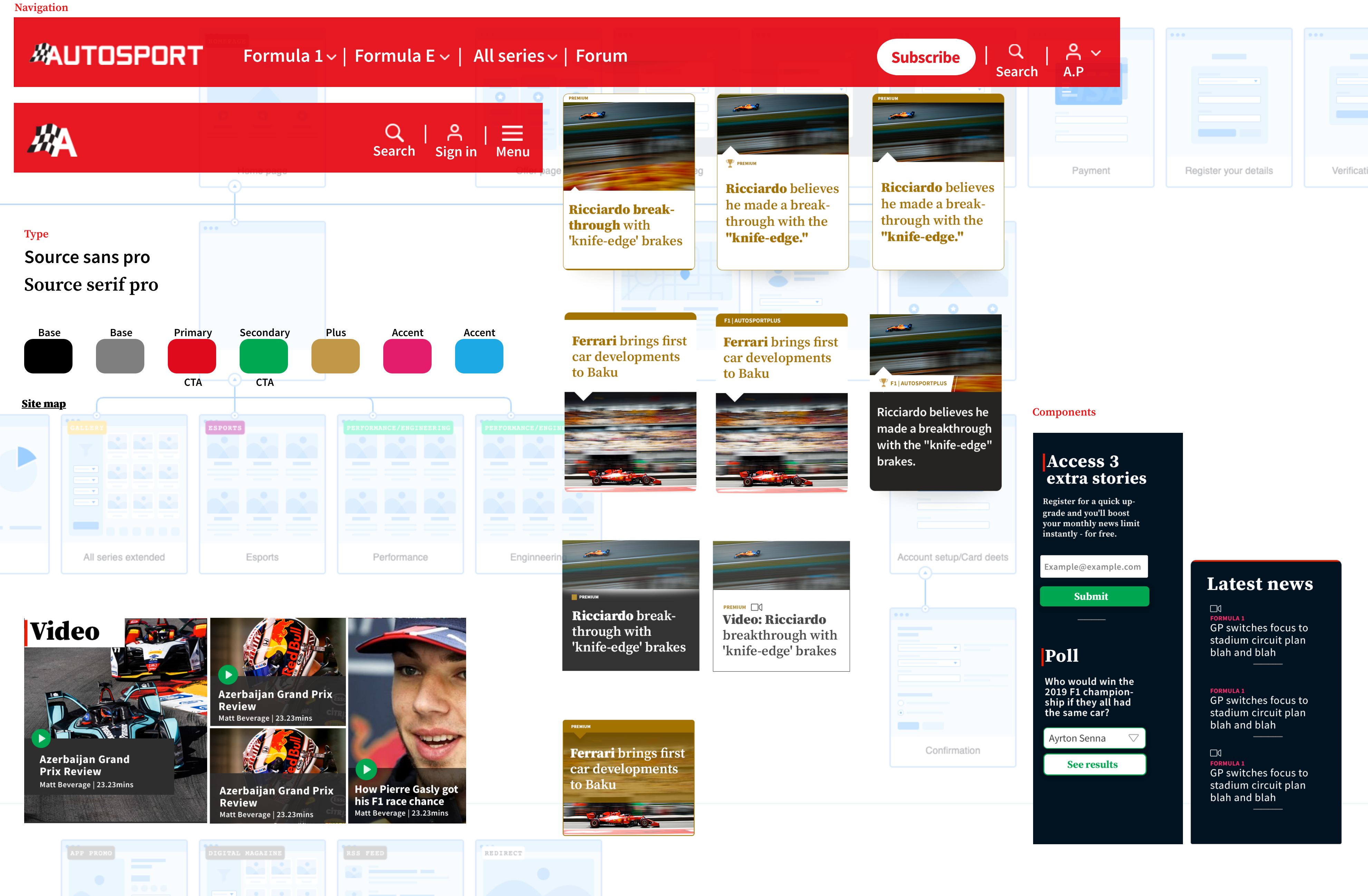
Component board.
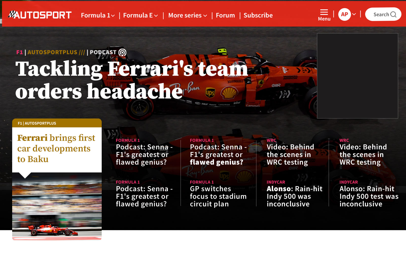
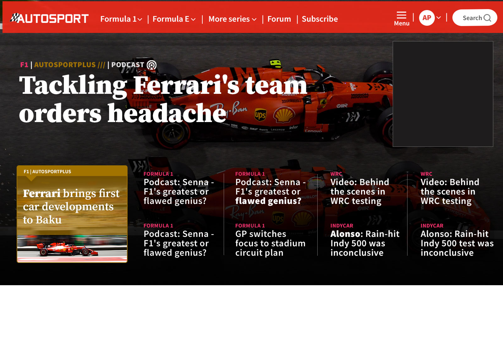
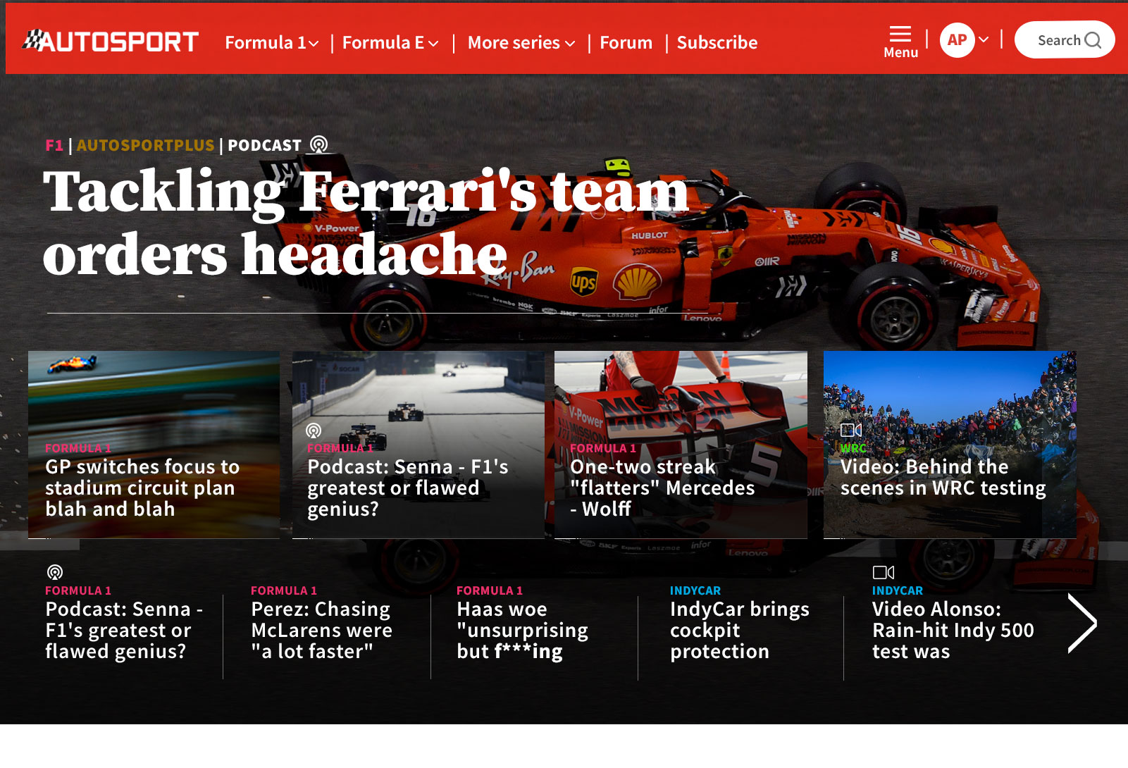
Homepage
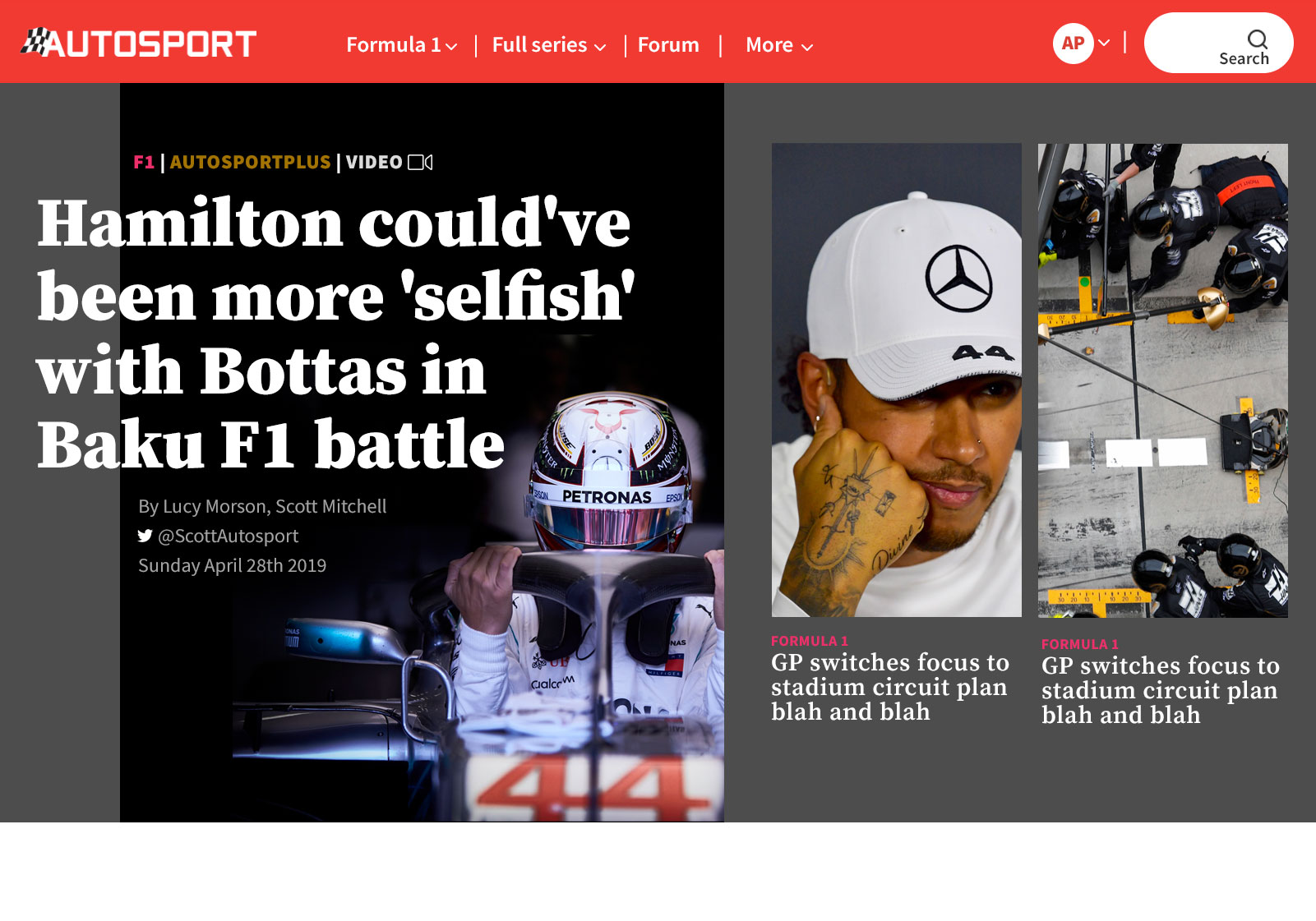
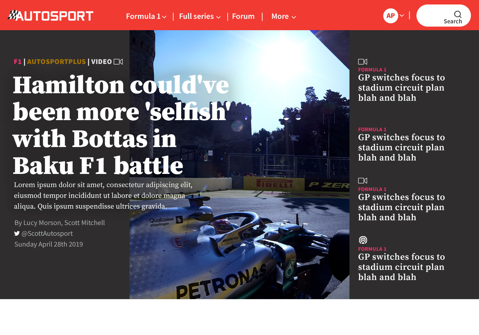
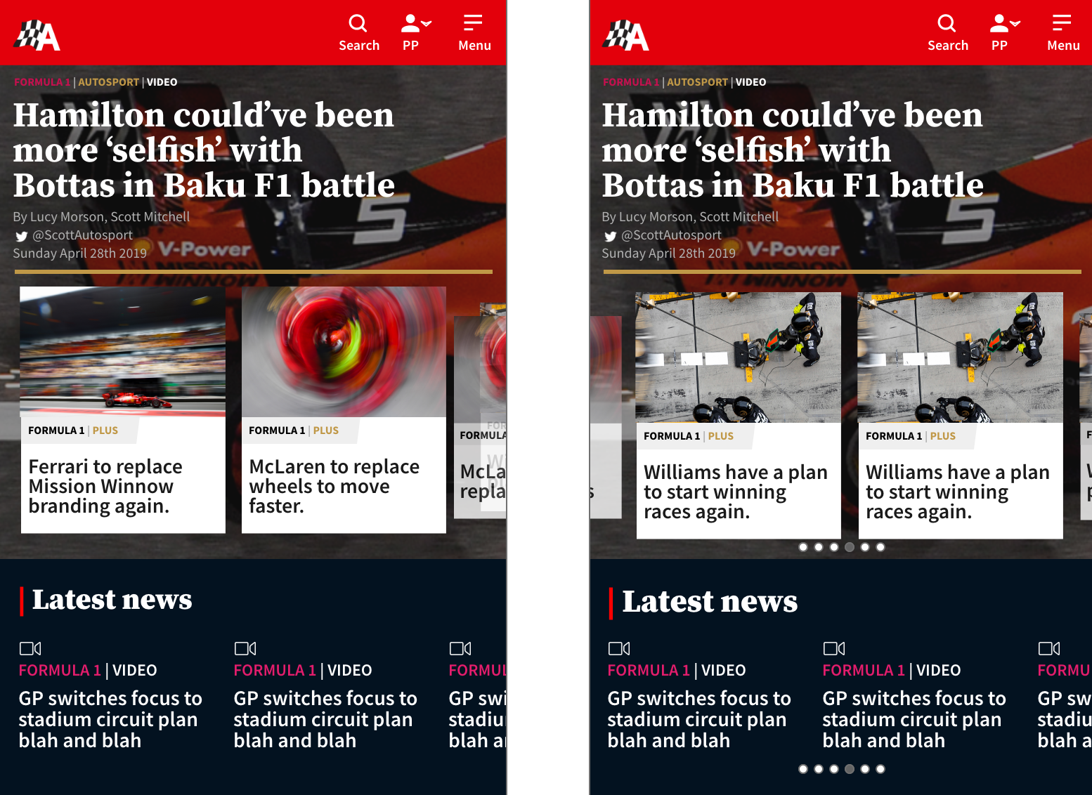
'Toppers' are an integral part of the site, heatmaps showed they attract a lot of engagement and obviously sits above the fold so getting this right was critical. Challenge was balancing the volume of content with usability. We found with the volume of data to present I found there were 3 different phases that could occur, race wkd, news and breaking news.