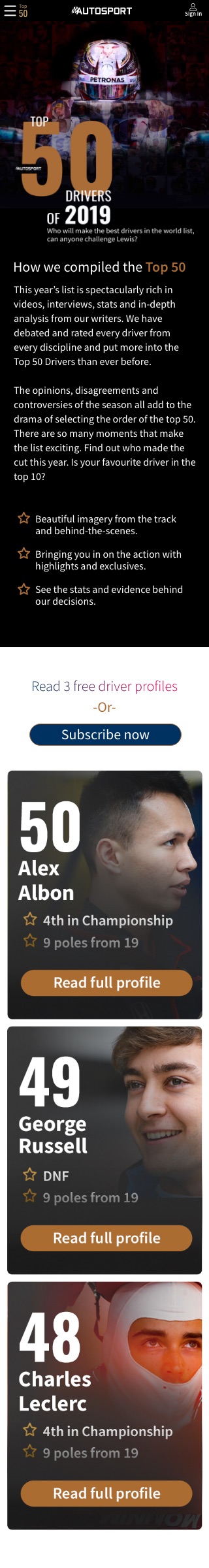
Top 50 history
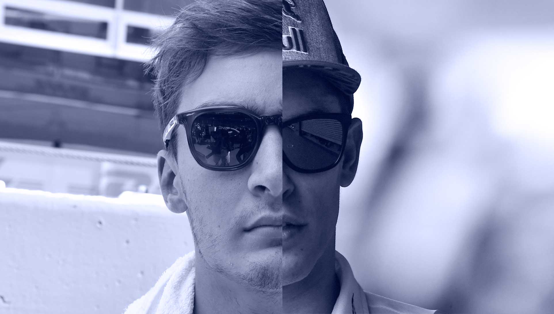
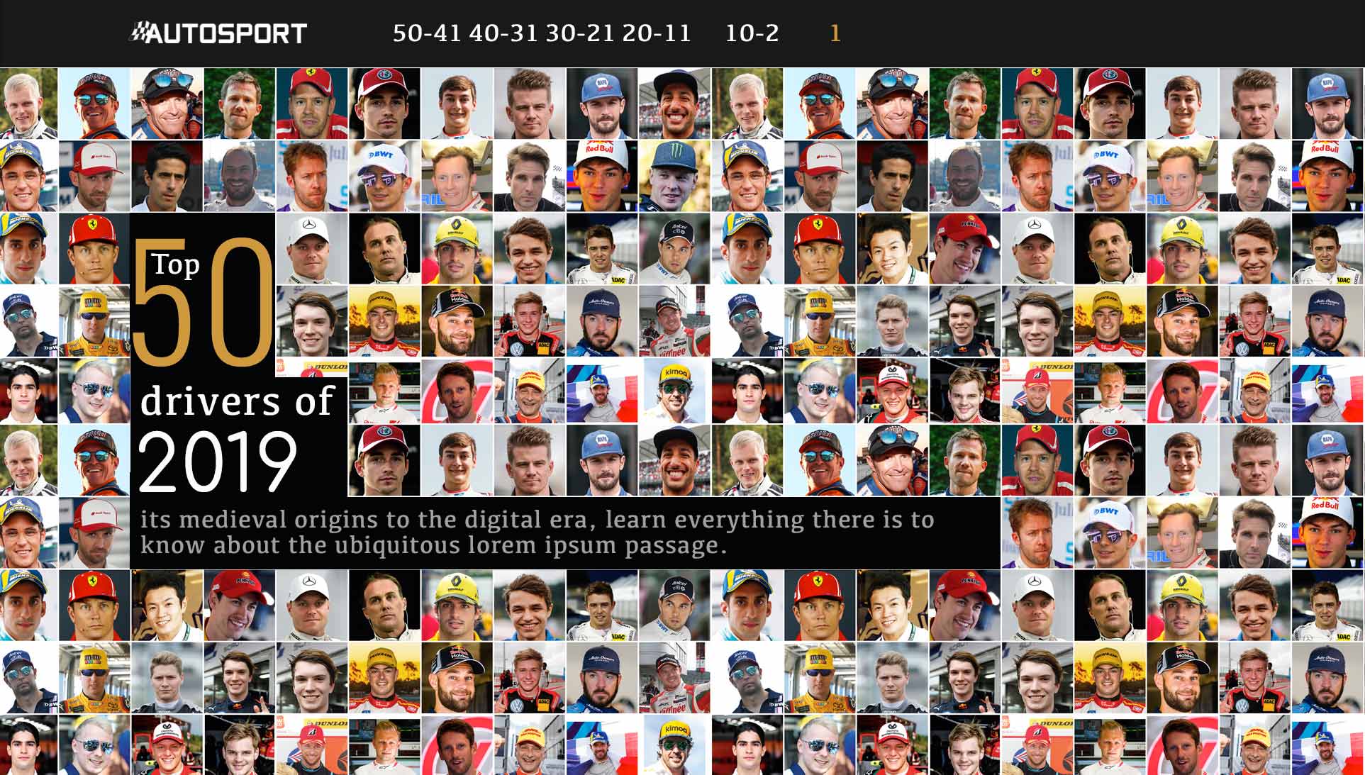
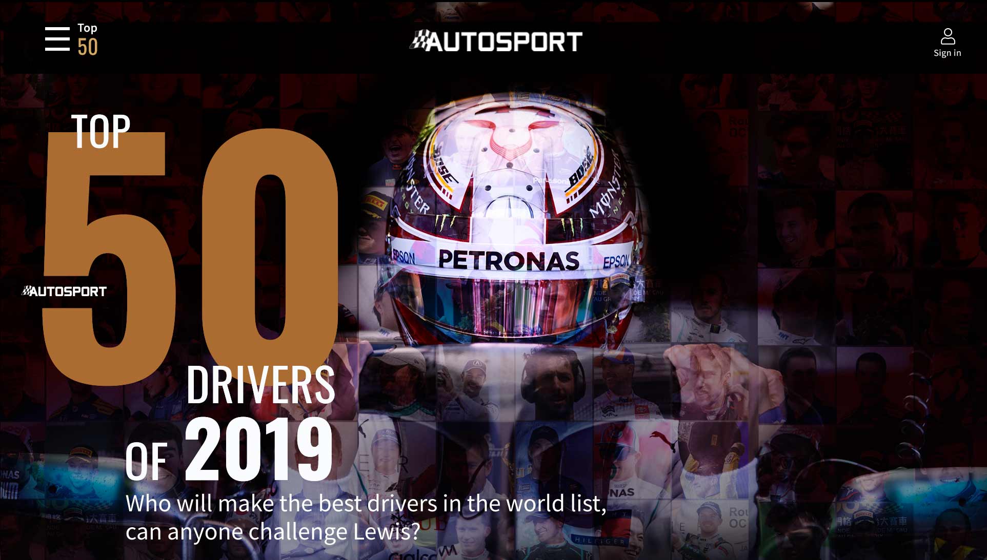
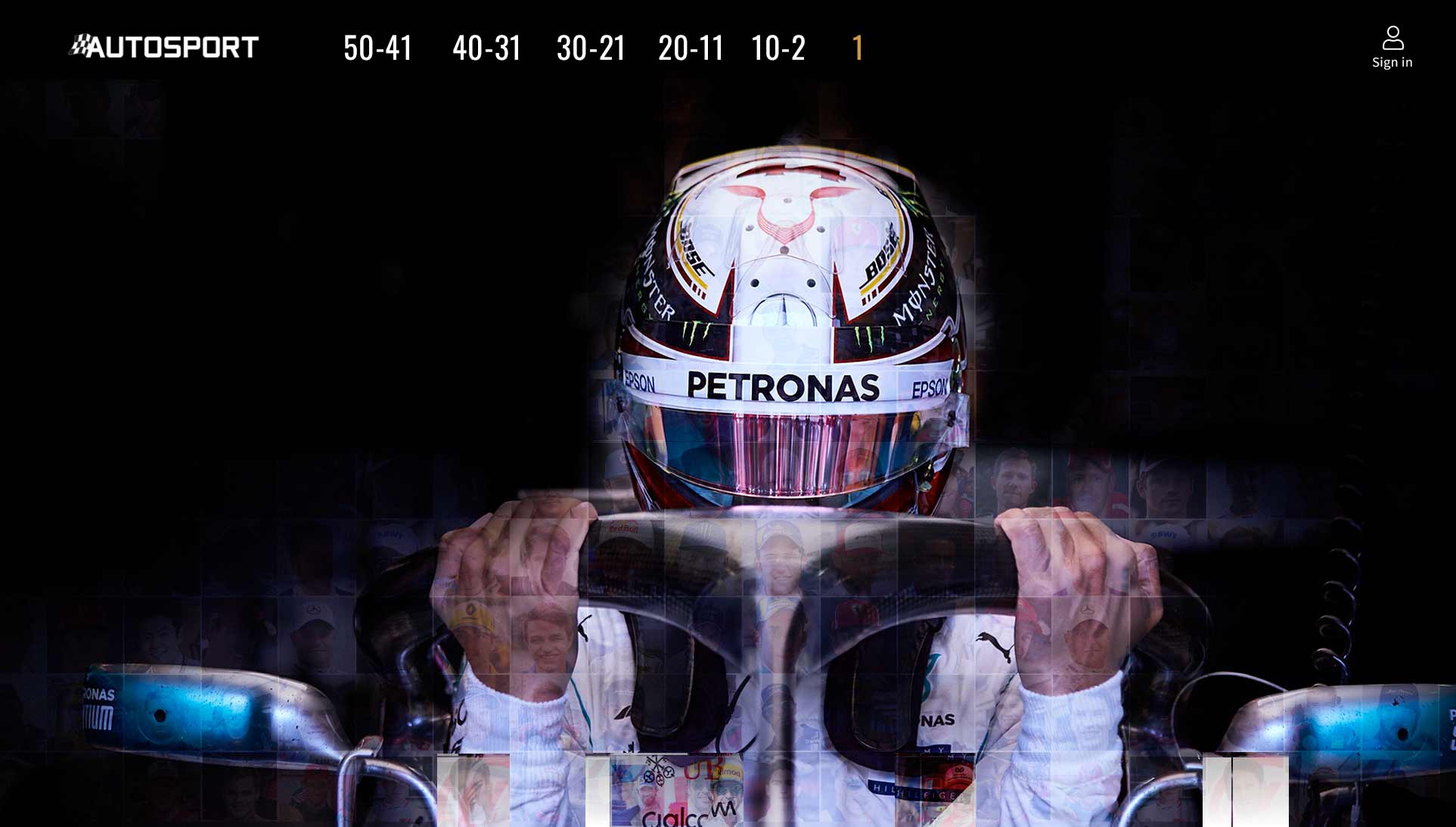
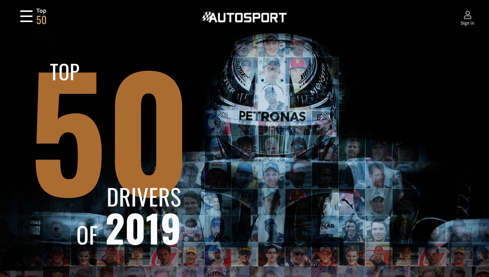
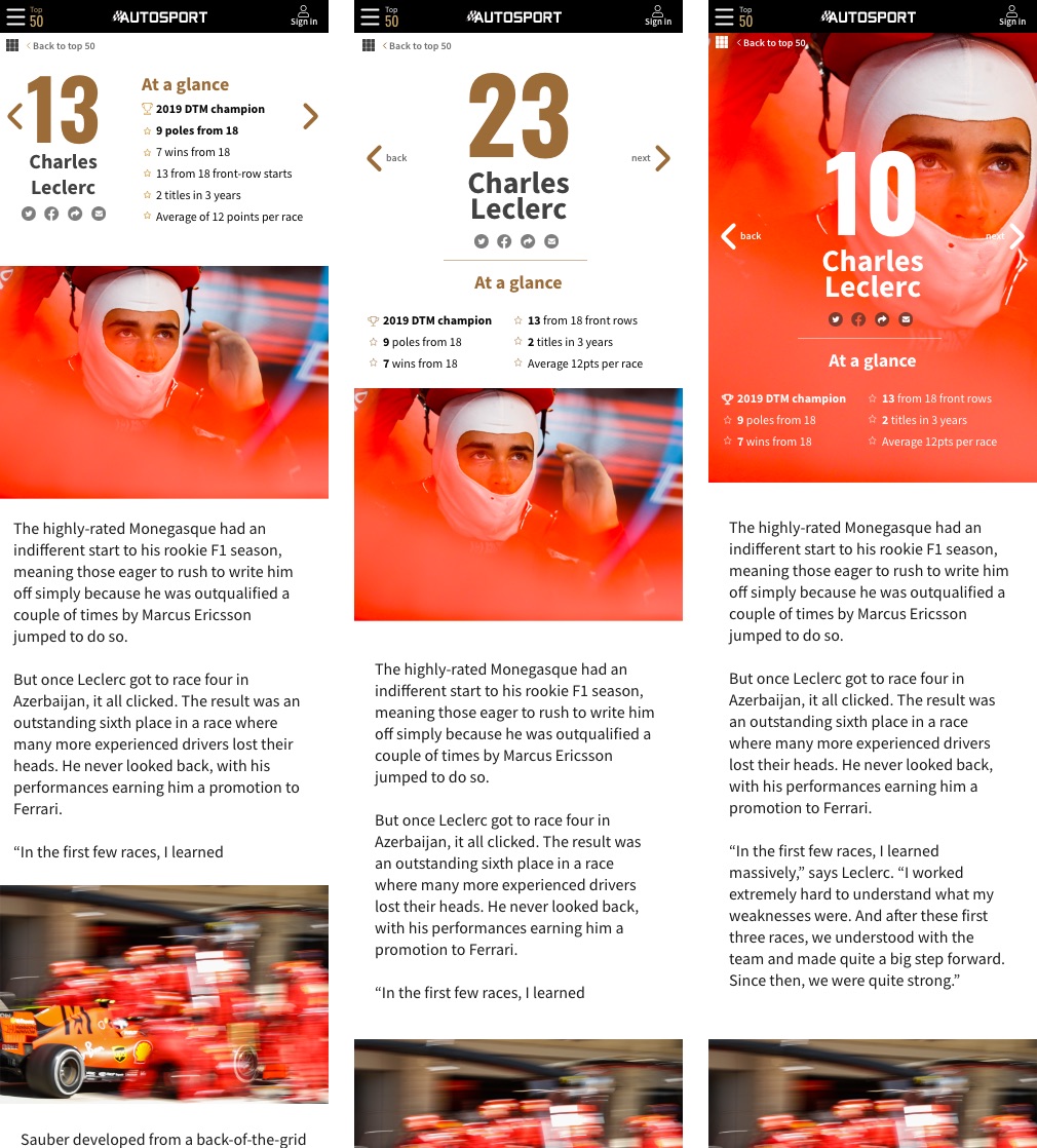
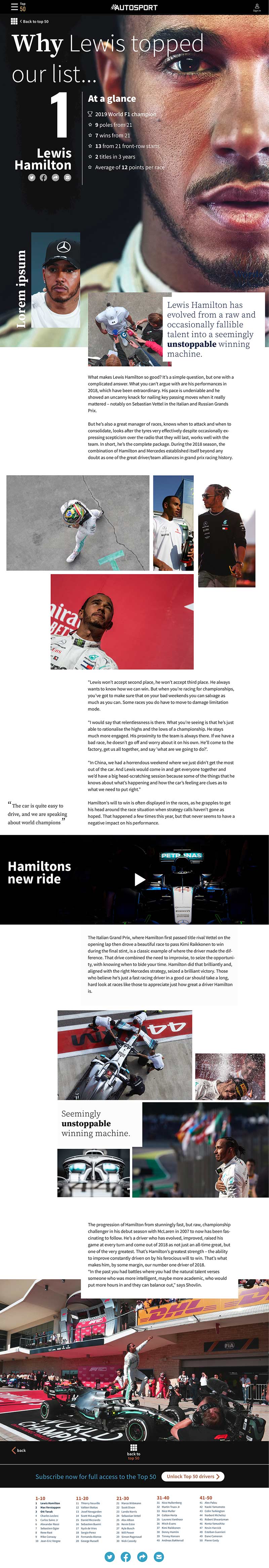
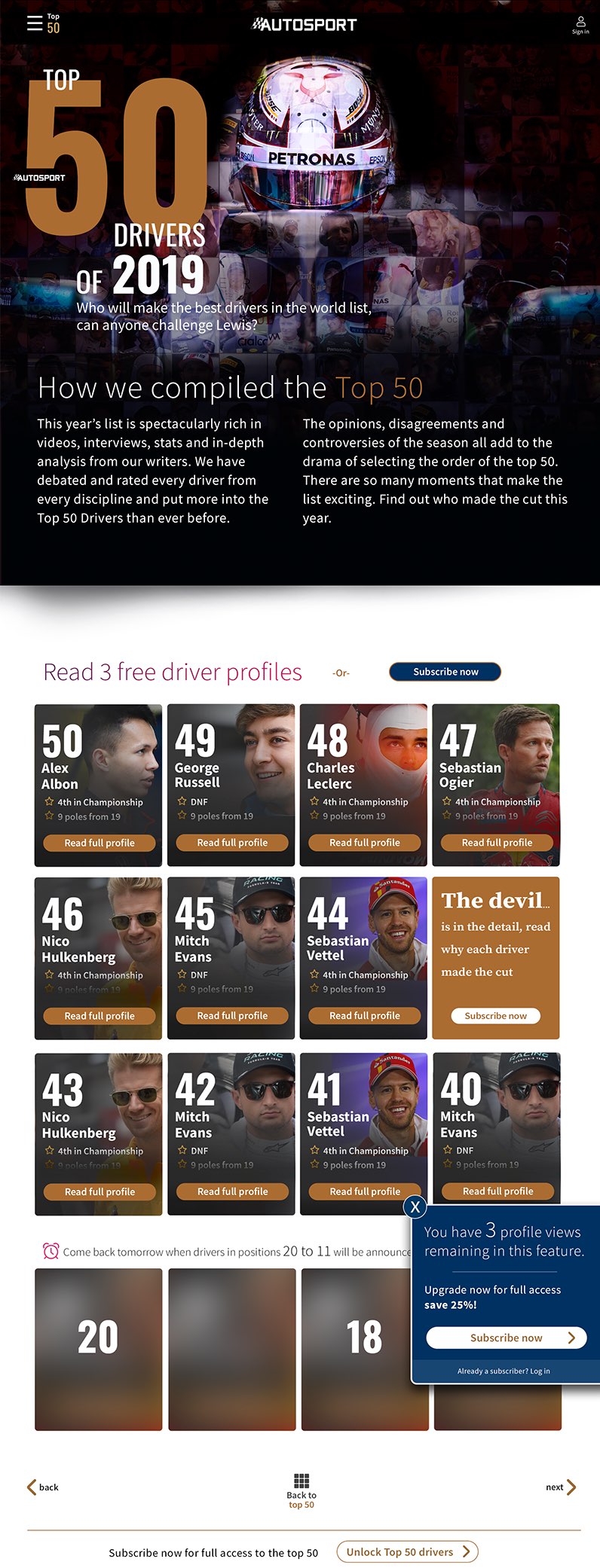
The Top 50 is a main stay of the calendar for AS, like The BBC Sports Personality, this is a big deal in the Motorsport industry and often ruffles a few feathers. I was keen to maintain some of the previous usability but also freshen up the look. There is a lot going on in the site and we were looking to change how the subscription was going to work, so it was a shake up, so keen to make it fresh but keep the usability close to previous years, with some refinements. Previous hero images tended to rely on cut outs and I wanted to connect the Top 50 concept with the imagery. The model of who wins was going to be more transparent, it was more about the content, so I didn't hide away from using last years winner and probable winner this year too. I wanted it to be powerful but also not dismiss the other drivers that will figure and challenge in the list. After a number of sketches I went into pixel mode and the strongest idea seemed to develop pretty quickly despite having a few ideas that may have involved some animation of faces morphing.
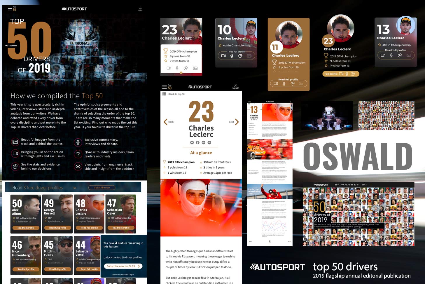
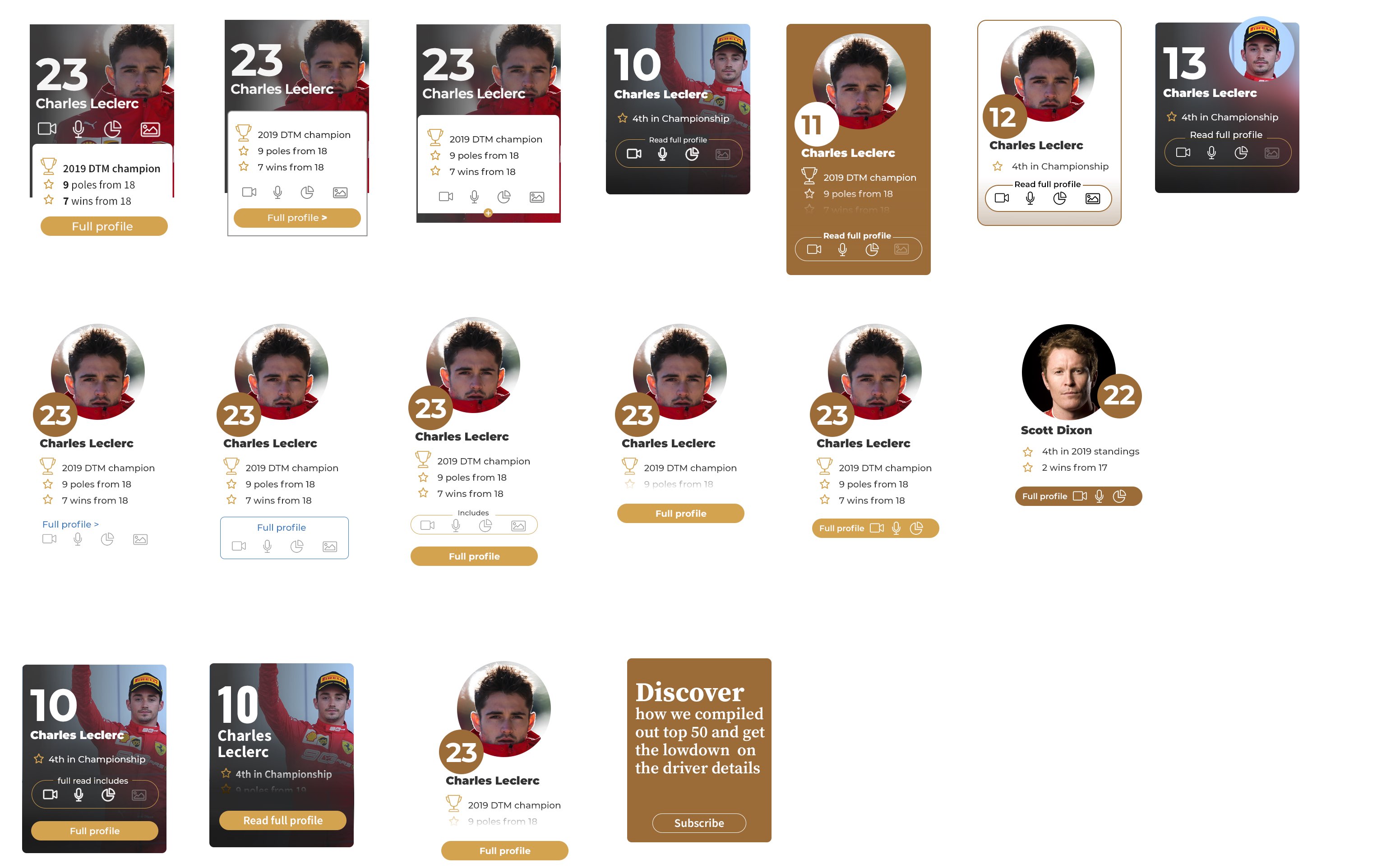
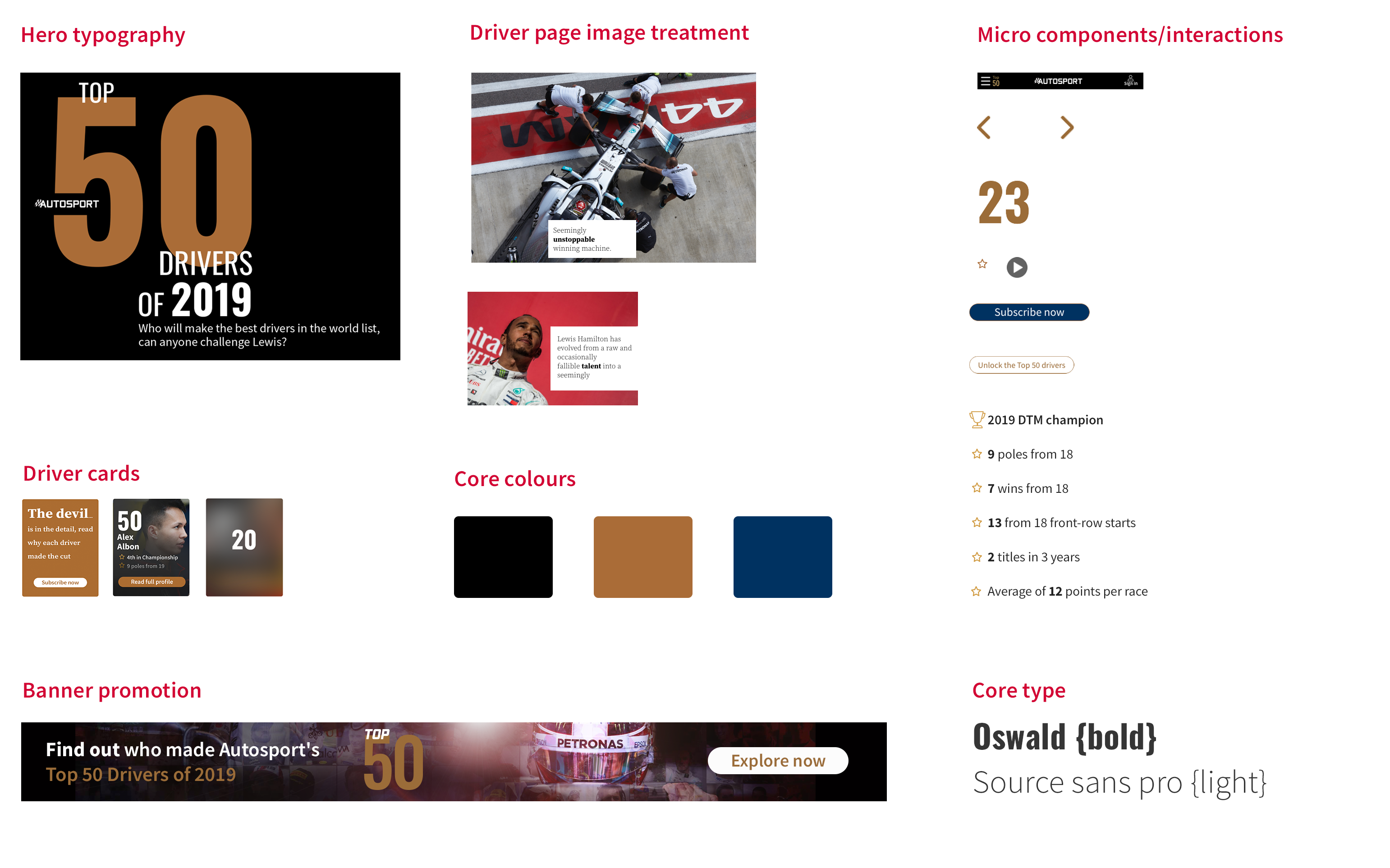
Component board.
The elements
As mentioned there was a lot that goes into production, so it was key the experience was clear, we wanted people to explore and read, that was ultimately how the 3 credits would get used up and trigger a subscription scenario, especially as we were releasing the Top 50 in phases.